Fiber Filtering Explorer

This page is currently under construction.

Context


  • Fiber Filtering Explorer serves to identify tracts associated with observed changes in clinical outcomes. Currently, the tool derives tracts from a structural connectome or using a pathway model.

  • The tool currently allows for three model setups: Stimulation volume based calculations, Electrical field based calculations and, the OSS-DBS approach for obtaining a pathway activation model.

    • The first one uses a combination of binary stimulation volumes and two-sample t-tests. Essentially, the investigated cohort is divided into two groups - one, which induces action potentials to streamline and the other, which has no effect at all.

    • The second strategy uses E-fields and correlation coefficients. The weight assigned to a streamline is a correlation coefficient of E-field vector magnitude and clinical improvement.

    • The OSS-DBS strategy also applies two-sample t-tests by calculating binary tract activation using OSS-DBS. Then, the streamlines are weighted by the clinical outcome of patients touching and not touching the streamline.

Fiber Filtering Explorer helps us understand which specific fiber tracts are associated with maximal clinical improvement.

How to


1. User Interface

Fiber Filtering Explorer builds upon Lead group. For this step, all the VTAs/E-fields have to be calculated (press the Calculate stats & VTA button in Lead group interface). Click on the Visualize 3D button inside Lead group and in the 3D viewer window, click on Add fiber filtering analysis button.

A new window with Fiber Filtering Explorer user interface pops up. In the first step, you can choose the connectome of your choice from the drop-down selection and press Calculate (Image 1). Once it is done, you will be able to continue with your analysis. To ensure that the Fiber Filtering Explorer detects your connectome of choice, place them inside a folder called "connectomes" within the leaddbs package.

In this analysis stream, you have to first calculate tract metrics for the normative connectome. Once this is done, you can explore the results more or less "live."

The time it takes to calculate connected fiber tracts depends on your sample size, normative connectome, and the available RAM on your computer.

2. Model Setup

Model Setup (Image 2, arrow 1) allows you to define methods and parameters to generate the computational model. For example, you can choose the Correlations/ E-field method of calculating tracts that correlate with the variable of interest (Image 2, arrow 2). The Variable of interest must be defined in the lead-group file previously. The rest of the arrows show the parameter space of the fiber filtering explorer. These are expanded below.

2.1 Model Setup Options

Two_Sample T-Test / VTAs (Baldermann 2019) / PAM (OSS DBS)

Figure 2.1 T-Test / VTA method

  • In this method, the same is done for binary VTAs (which in the case of Lead-DBS are thresholded E-Fields).

  • Fig. 2.1 A: Each tract can either be connected or not connected to any VTA. Thus, each single tract splits the group of VTAs (in template space) into two sets.

  • Fig. 2.1 B: When calculating Two-sample T-tests between a clinical/behavioral variable (e.g. %-UPDRS-III improvement) observed in the group of connected vs. unconnected VTAs, we will get a T-value for each tract.

  • Fig. 2.1 C: We can now use these values (T-scores) to color-code and select tracts for visualization.

One-Samplte Tests / VTAs / PAM (OSS-DBS)

Correlations / E-Fields (Irmen 2020)

Figure 2.2 Spearman's Correlations / E-Fields method

  • In this method, each single tract is selected from the normative connectome. The statistics are calculated for each tract separately. In the figure above, one example tract can be seen (A). Note how parts of this tract traverse "through" some of the E-Fields estimated in your Lead Group analysis (shown in yellow). They traverse less closely to the ones shown in blue but will still traverse through areas of those E-Fields that have a lower magnitude sum (remember that the E-Field is the estimated vector field denoting changes in Voltage induced by the stimulation. It's magnitude would be the absolute difference of Voltage between two points).

  • Fig. 2.2 A: Each tract is represented as discrete points in space (N x 3 vector if N is the length of the tract; red dots in (A)). The average values at these points for each E-Field (regardless as yellow or blue in A) will be sampled. Depending on your strategy / concept (see below), these values can now be averaged or summed up. Alternatively, you can simply use the peak value (more conforming to the "all or nothing" principle of action potentials) or the 5% peak values. This strategy will lead to one value for each pair of tract and E-Field (N x M if N is number of tracts and M is number of E-Fields; represented as fibsval for each hemisphere in the code).

  • Fig. 2.2 B: When calculating Spearman's correlations between this structure and a clinical/behavioral variable (e.g. %-UPDRS-III improvement), we will get one Spearman's correlation coefficient for each tract.

  • Fig. 2.2 C: We can now use these coefficients (R) to color-code and select tracts for visualization.

Proportion Test (Chi-Square) / VTAs (binary vars)

Binomial Tests / VTAs (binary vars)

Reverse T-Test / E-Fields (binary vars)

Plain Connections

Tracts connected if peak E-Field Magnitude they traverse is > … V/mm ...

Tracts connected to > … % of E-Fields

Variable of interest (VOI) is the dependent variable, such as clinical score (Image 2, arrow 2). This variable can also be cleaned from covariates (Image 2, arrow 8).

Subcohorts can be created by selecting patients in the bottom window this selection can be saved by clicking on Subcohorts (Image 2, arrow 5) and selecting one of the options: Create Subcohort from Selection or Create Subcohort from Inverse Selection.

If Mirror VTAs/Efields box is selected (Image 2, arrow 9), VTAs/Efields from one hemisphere will also be used for the second hemisphere (mirroring the effect).

VTAs show (Figure 2, arrow 6) ...

Connected Fibers Show (Figure 2, arrow 7) ...

3. Visualisation & Thresholding

The tool allows you to visualize the fibers, as it is essential to check whether they make sense anatomically. You can include only significant fibers in your analysis, by ticking Consider Significant Fibers only(Figure 3, arrow 1) and als othe correction strategy (Fiure 3, arrow 2). You can also select different types of thresholding for the fibers, set to Show Negative Fibers or Show Positive Fibers and also set Fixed Amount of positive and negative fibers (Figure 3, arrow 4).

The model you selected can also be exported: Export as Atlas or Export Model (Figure 3, arrow 6).

After you select all the settings, press Refresh View or alternatively, tick the Auto-Refresh box that will refresh the view automatically (Figure 3, arrow 7).

4. Crossvalidation & Prediction

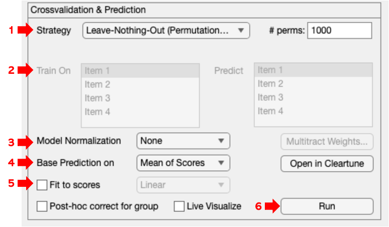
The final step across frameworks is Crossvalidation & Prediction (Image 1, red arrow 3). This step is crucial to establish the validity of generated models within and generalizability across cohorts. Current validation strategies include permutation (Leave-Nothing-Out) based approaches, as well as Leave-One-Patient-Out, Leave-One-Cohort-Out, and k-fold (randomized) cross-validations (Image 4, arrow 1). In addition, it is possible to customize this process and generate predictions for individual patients, as well as predefined subcohorts, cohorts, and sets (Image 4, arrow 2).

Model Normalization allows you to select a z-score method or von Albada 2007 method (Figure 4, arrow 3).

Base Prediction on (Figure 4, arrow 4):

Mean of Scores

Sum of Scores

Peak of Scores/Peak 5% of Scores

Histogram/Z-scored Histogram

At last, data can be fit to scores and post-hoc corrected for groups (Figure 4, arrow 5).

5. Multitract Analysis

Output


Publications:


  1. Hollunder, B. et al. (2022) ‘Toward personalized medicine in connectomic deep brain stimulation’, Progress in Neurobiology, 210, p. 102211. Available at: https://doi.org/10.1016/j.pneurobio.2021.102211.

  2. Horn, A. et al. (2022) ‘Optimal deep brain stimulation sites and networks for cervical vs. generalized dystonia’, Proceedings of the National Academy of Sciences, 119(14), p. e2114985119. Available at: https://doi.org/10.1073/pnas.2114985119.

  3. Neudorfer, C. et al. (2023) ‘Lead-DBS v3.0: Mapping deep brain stimulation effects to local anatomy and global networks’, NeuroImage, 268, p. 119862. Available at: https://doi.org/10.1016/j.neuroimage.2023.119862.

  4. Ríos, A.S. et al. (2022) ‘Optimal deep brain stimulation sites and networks for stimulation of the fornix in Alzheimer’s disease’, Nature Communications, 13, p. 7707. Available at: https://doi.org/10.1038/s41467-022-34510-3.

References:

Information on this page was taken from the book "Connectomic Deep Brain Stimulation" by Horn, 2022 and the following research publication:

  • Neudorfer C, Butenko K, Oxenford S, Rajamani N, Achtzehn J, Goede L, Hollunder B, Ríos AS, Hart L, Tasserie J, Fernando KB, Nguyen TAK, Al-Fatly B, Vissani M, Fox M, Richardson RM, van Rienen U, Kühn AA, Husch AD, Opri E, Dembek T, Li N, Horn A. Lead-DBS v3.0: Mapping deep brain stimulation effects to local anatomy and global networks. Neuroimage. 2023 Mar;268:119862. doi: 10.1016/j.neuroimage.2023.119862. Epub 2023 Jan 5. PMID: 36610682; PMCID: PMC10144063.


Last updated