Sweetspot Explorer

This page is currently under construction.

Content


  • Sweetspot Explorer allows users to identify local clusters that are associated with the clinical outcome following the DBS, e.g. % UPDRS-III improvement following STN-DBS for Parkinson's disease.

  • It has been developed to map anatomical hot- and cold-spots within DBS targeted regions.

  • The Sweetspot Explorer explains the outcome based on the stimulation location, which can be determined in several ways: as coordinates of active electrodes, weighted by the distance from the active electrode via a Gaussian function, as a binary VTA (thresholded here at 200V/m), or weighted by the strength of the electric field (thresholded here at 100V/m).

How to


1. User Interface

Sweetspot Explorer builds upon the Lead group and therefore, all the VTAs/E-fields have to be calculated (press the Calculate stats & VTA button in the Lead group interface) in order to use it. Click on the Visualize 3D button inside the Lead group and in the 3D viewer window, click on Add sweetspot analysis the button.

A new window with the Sweetspot Explorer user interface pops up, offering a selection of methods for further analysis. This window can be divided into 3 subparts: Interactive Model Setup, Visualization & Thresholds, and Crossvalidation & Prediction (Figure 1).

2. Model Setup

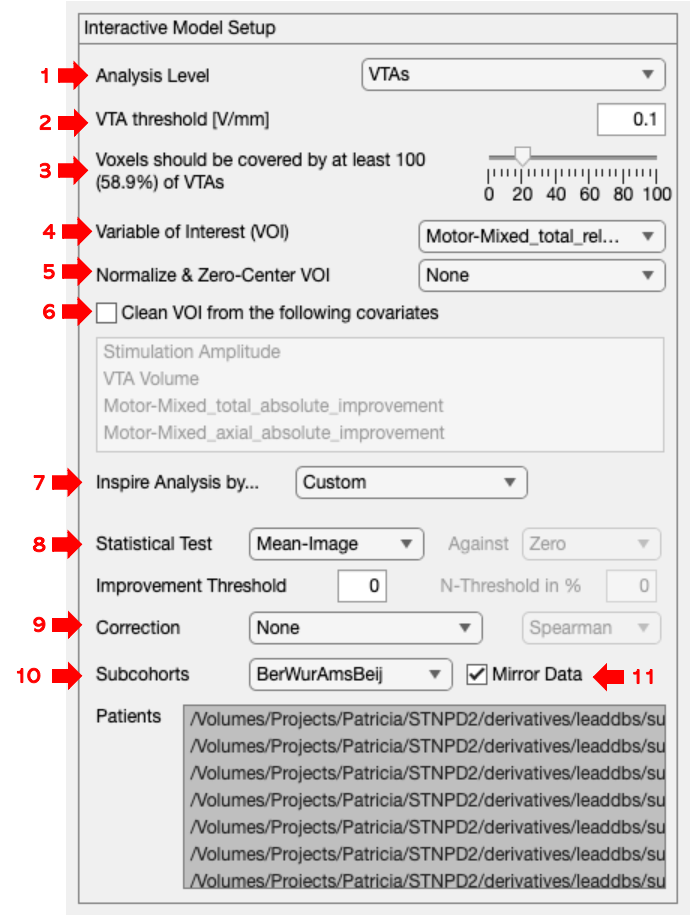
  • Interactive Model Setup (Image 1, arrow 1) allows users to define methods and parameters to generate the computational model. One can define the analysis level, subcohort selection, dependent variable selection, covariates, statistical tests, and the option to mirror VTAs/Efields (Image 2, arrows 1-8).

  • Analysis Level - allows users to simply select whether they want to use VTAs or E-Fields for their model. VTAs are stored in binary format [0 and 1], where all voxels within the VTA (voxels labelled as 1) are stimulated and all the voxels outside (voxels labelled as 0) are not stimulated. E-Fields are stored in a continuous fashion and contain information on the spatial distribution of the voltage. Based on the selection here, a further selection of options in "Inspire Analysis by ..." (Figure 2, arrow 1) will be determined.

  • VTA/E-Field Threshold [V/mm] - determines what effect will be considered as “stimulating” (Figure 2, arrow 2).

  • Voxels covered - Allows users to define the VTA/E-Field threshold required for voxels to be included in the model (Figure 2, arrow 3).

  • Variable of Interest (VOI), Normalize & Zero-Center VOI & Clean VOI from the following covariates - (Figure 2, arrows 4-6)

2.1 Inspire Analysis by ...

These options allow users to select one of the methods from previously published literature, or also create a custom model. The descriptions below were adapted from Dembek et al., 2022 and Elias et al., 2021.

Butson 2011

Butson et al., (2011) mapped a sweetspot in patients suffering from Parkinson’s disease using a VTA-based model. The mean-effect image was generated and thresholded to select voxels with the average clinical improvement above 50%.

Cheung 2011

Cheung et al., (2011) mapped a sweetspot of patient suffering from dystonia by looking at patients with good DBS outcome and the voxels that were covered by VTAs most often in those cases. In their cohort, 75% of patients with the best outcome were used.

Eisenstein 2014

Eisenstein et al., (2014) used voxel-wise statistics to define voxels associated with a significant improvement of patients suffering from Parkinson's disease. The outcome was weighted for each voxel dependent on its distance from the active electrode contact. Each voxel was then assigned a resulting weighted outcome, and then tested against zero. Results determined voxels leading to a significant improvement.

Reich 2019

Reich et al., (2019) used VTA based mean-image and identified voxels that had significantly higher clinical outcome compared to the average of all VTA outcomes, which did not stimulate that particular voxel.

Dembek 2019

Dember et al., 2019 generated a mean-effect image combined with voxel-wise statistics to compare the outcomes in each voxel against average outcomes of the cohort as a whole.

Elias 2020

Elias et al., (2020) weighted each patient’s VTA by the corresponding % change from basline and calculated mean outcome metric. Then generated an N-map (frequency map) representing the number of VTAs that overlapped a given voxel and thresholded this map at 10%. Two-tailed voxel-wise Wilcoxon-signed rank tests were performed, generating a p-map denoting the confidence about association between stimulation at each voxel and the clinical improvement. P-map was then used as a mask over an average map (Elias et al., 2020).

2.2 Statistical Test

Mean-Image

Mean-Image with VTAs is calculated by the summation of multiplication of the VTA and the outcome parameter. The resulting image corresponds to the sum of clinical outcomes that are caused by the VTAs stimulating those voxels. The voxels in this sum image are then divided by how often they were stimulated – showing the average outcome.

N-Image

N-Image represents the number of times the voxel was covered by VTAs from the dataset. It is simply generated by adding up all the VTAs. It does not include information on the stimulation outcomes and only informs on the location where patients were stimulated.

T-Test

Wilcoxon-Test

Proportion Test (Binary Var)

Binomial Test (Binary Var)

  • Subcohorts can be created by selecting patients in the bottom window. This selection can be saved by clicking on Subcohorts (Image 2, arrow 10) and selecting one of the options: Create Subcohort from Selection or Create Subcohort from Inverse Selection.

  • If Mirror Data box is selected (Image 2, arrow 11), VTAs/Efields from one hemisphere will also be used for the second hemisphere (mirroring the effect).

3. Visualisation & Thresholding

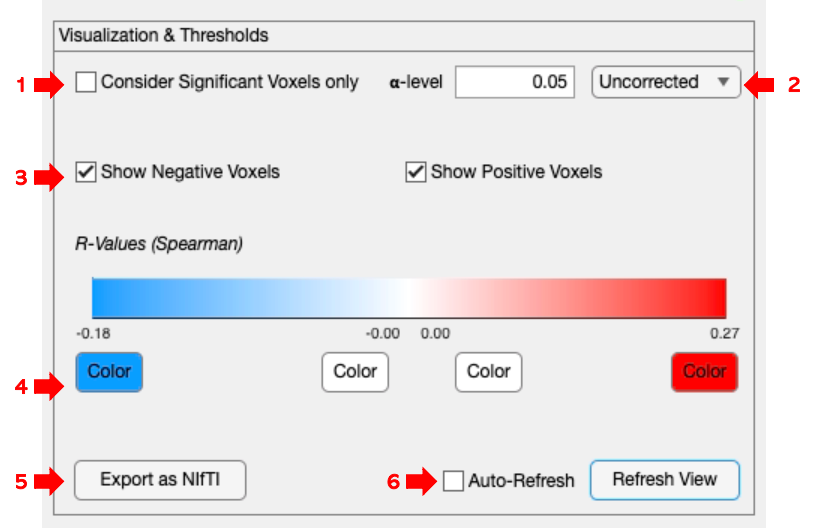
  • The generated sweet and sour spots can be visualized and further adjusted during Visualization & Thresholding (Image 1, red arrow 2). Specifically, this step allows thresholding of the generated maps based on a predefined alpha level and correction for multiple comparisons (Image 3, arrows 1&2).

  • Users can select to visualize voxels positively or negatively correlated with your selected dependent variable (Image 3, arrow 3) and change their color (Image 3, arrow 4).

  • For more advanced post-hoc analysis, the option to export the generated maps in the form of NIfTI files is also available, by clicking on Export as NIfTI (Image 3, arrow 5). These NIfTI images can then be visualized and processed in Slicer. For further information please consult Sweet-sour spot.

  • After users finish the selection of all settings, pressing Refresh View or alternatively, ticking the Auto-Refresh box will refresh the view automatically (Image 3, arrow 7).

4. Crossvalidation & Prediction

  • The final step across frameworks is Crossvalidation & Prediction (Image 1, red arrow 3). This step is crucial in establishing the validity of generated models within and generalizability across cohorts. Current validation strategies include permutation (Leave-Nothing-Out) approaches, as well as Leave-One-Patient-Out, Leave-One-Cohort-Out, and k-fold (randomized) cross-validations (Image 4, arrow 1). In addition, it is possible to customize this process and generate predictions for individual patients, as well as predefined subcohorts, cohorts, and sets (Image 4, arrow 2).

  • The drop-down window allows users to select a strategy, based on which predictions will be made. The current selection uses the mean of scores, the sum of scores, the peak of scores, and the peak of 5% of scores (Image 4, arrow 3).

  • If that option is selected, the results can also be post-hoc corrected for the group (Image 4, arrow 4).

Output


  • Sweetspots corresponding to improvement.

  • Model results.

  • Cross-validation correlation plot.

Publications:


  1. Horn, A. et al. (2022) ‘Optimal deep brain stimulation sites and networks for cervical vs. generalized dystonia’, Proceedings of the National Academy of Sciences, 119(14), p. e2114985119. Available at: https://doi.org/10.1073/pnas.2114985119.

  2. Neudorfer, C. et al. (2023) ‘Lead-DBS v3.0: Mapping deep brain stimulation effects to local anatomy and global networks’, NeuroImage, 268, p. 119862. Available at: https://doi.org/10.1016/j.neuroimage.2023.119862.

  3. Ríos, A.S. et al. (2022) ‘Optimal deep brain stimulation sites and networks for stimulation of the fornix in Alzheimer’s disease’, Nature Communications, 13, p. 7707. Available at: https://doi.org/10.1038/s41467-022-34510-3.

References:


Information on this page was taken from the book"Connectomic Deep Brain Stimulation" by Horn, 2022 and the following research publications:

  1. Neudorfer C, Butenko K, Oxenford S, Rajamani N, Achtzehn J, Goede L, Hollunder B, Ríos AS, Hart L, Tasserie J, Fernando KB, Nguyen TAK, Al-Fatly B, Vissani M, Fox M, Richardson RM, van Rienen U, Kühn AA, Husch AD, Opri E, Dembek T, Li N, Horn A. Lead-DBS v3.0: Mapping deep brain stimulation effects to local anatomy and global networks. Neuroimage. 2023 Mar;268:119862. doi: 10.1016/j.neuroimage.2023.119862. Epub 2023 Jan 5. PMID: 36610682; PMCID: PMC10144063.

  2. Elias, G.J.B., Boutet, A., Joel, S.E., Germann, J., Gwun, D., Neudorfer, C., Gramer, R.M., Algarni, M., Paramanandam, V., Prasad, S., Beyn, M.E., Horn, A., Madhavan, R., Ranjan, M., Lozano, C.S., Kühn, A.A., Ashe, J., Kucharczyk, W., Munhoz, R.P., Giacobbe, P., Kennedy, S.H., Woodside, D.B., Kalia, S.K., Fasano, A., Hodaie, M. and Lozano, A.M. (2021), Probabilistic Mapping of Deep Brain Stimulation: Insights from 15 Years of Therapy. Ann Neurol, 89: 426-443. https://doi.org/10.1002/ana.25975

  3. Dembek TA, Baldermann JC, Petry-Schmelzer JN, Jergas H, Treuer H, Visser-Vandewalle V, Dafsari HS, Barbe MT. Sweetspot Mapping in Deep Brain Stimulation: Strengths and Limitations of Current Approaches. Neuromodulation. 2022 Aug;25(6):877-887. doi: 10.1111/ner.13356. Epub 2022 Feb 10. PMID: 33476474.

Last updated